This image appeals to me because of the way that the arrow is central to the image and is pointing at the subject so is guiding the eye towards the subject.
I have used the colour select tool to turn the image black and white and keep the brighter yellow of the arrow to draw the eye in to the picture. The black and white background also helps to bring out the different variations if tone in the image.
I like this image because of the way that the lighting adds tone and dimension.
I have altered this image by adding a black and white layer to the image and reducing the lightness of the image as well as giving the image a higher range of contrast to increase the tonal aspects of the image.
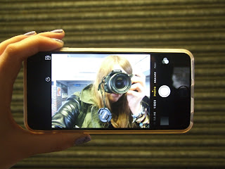
This image appeals to me because of the different tones created by the lighting and shadows as we,l as the variation in tone provided by the phones screen.
I have altered the image by adding a black and white filter to enhance the tonal aspects of the image which have been previously highlighted such as shadows and lighting. I have also increased the contrast and reduced the lighting of the image.
This image appeals to me because of the way that the shadows and staged lighting provides a great deal of tonal variation through both light and shadow to give the image dimension.
I have added a red toned filter to the image as well as reducing the images saturation to show tone.
This image appeals to me because of the different tones of grey and blue which are displayed in both the feather and the concrete.
I have altered this image by adding a black and white filter and increasing the images saturation and contrast to enhance the tone of the image.


No comments:
Post a Comment