
Showing posts with label Colour. Show all posts
Showing posts with label Colour. Show all posts
Monday, 25 April 2016

Monday, 28 September 2015
Colour- Work diary
Evaluation

This is my favourite image for colour due to the way that the bold yellow stands out against the dull grey background. I find this image especially appealing due to the fact that I did not edit this image in photo shop.
This is my lest favourite image due to the fact that I don't believe that colour is well represented in this image.
The objective of the assignment was to capture the formal element of colour through photography. This element was particularly enjoyable to capture for me due to the fact that colour is present in all things in various different forms such as muted and saturated. This formal element overlaps with other elements due to the fact that everything has colours in it.
Favourite image
1/500, f/5.3, ISO 1600

Least favourite image

1/800, f/14, ISO 1600

Progression
I think this shoot went very well due to the fact that it was a very bright sunny day meaning that the colours present were particularly vibrant which helped to make the complimentary colours stand out against each other.
Aspirations
I like the appearance of Vivian Meyer's work as it displays colour in a simplistic and understated way.


Aspirations
I like the appearance of Vivian Meyer's work as it displays colour in a simplistic and understated way.


Tuesday, 22 September 2015
Colour- Definition post
Colour definitions
Dictionary definition- The property possessed by objects which produces sensations on the eye depending on the way which the object emits or reflects rays of light.
Personal definition- The hue or tone of an object.
Saturation- The intensity of a colour the more saturated the image the brighter the colours.
Hue- a colour or shade.
Value- the relative lightness or darkness of a colour.

Saturated colour- Colours which have an increased intensity.
Muted colour- Colours which have a reduced intensity.

Analogous colours- Groups of three colours which are side by side on the colour wheel. Comprised of one primary colours, one secondary colour and one tertiary colour.

Complimentary colours- Colours which are on opposite sides of the colour wheel so make each other stand out. When combined they can also make black or white.

Dictionary definition- The property possessed by objects which produces sensations on the eye depending on the way which the object emits or reflects rays of light.
Personal definition- The hue or tone of an object.
Saturation- The intensity of a colour the more saturated the image the brighter the colours.
Hue- a colour or shade.
Value- the relative lightness or darkness of a colour.

Saturated colour- Colours which have an increased intensity.
Muted colour- Colours which have a reduced intensity.

Analogous colours- Groups of three colours which are side by side on the colour wheel. Comprised of one primary colours, one secondary colour and one tertiary colour.

Complimentary colours- Colours which are on opposite sides of the colour wheel so make each other stand out. When combined they can also make black or white.

Monday, 21 September 2015
Colour- image bank

I like this image because of the way that the complimentary colours of red and green make the red flowers stand out dramatically against the green background. The fact that the background of the image is blurred and so the image has an increased depth of field helps to make the red flowers stand out.

I like this is image due to the fact that the shallow depth of field used has created a blurred background which makes the bright pinky purple flowers in the images foreground stand out against the dull yellow of the background. This is also a pleasing image due to the fact that the pinky purple and muted yellow used are complimentary colours.

I like this piece because of the placement of the bike in one of the thirds of the image this draws the eye in to the picture the woman is also in a third of the image but the depth of field allows the eye to focus on the bike first and then focus on the more blurred woman afterwards. I also like the fact that both the bike and the woman have splashes of red on them, this helps to pull the image together as well as to draw the eye in.


I like these images due to the way that the bright multicoloured lights of both the candles flames and the lanterns bulbs create a strong sense of contrast between the images subject and the it's black background. These images are particularly interesting due to the way in which each image creates a strong sense of contrast and guides the viewers eye through the use of colour without having to employ a shallow depth of field.
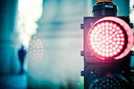
I like this picture because of the way that the colours are muted and dull it makes the muted red stop light stand out against the rest of the dull image. The stop light also stands out due to its placement in the third of the image so that the viewers eye is drawn to it.
Thursday, 17 September 2015
Colour- Straight images
Colour- Straight images


I like this image because I like the way that the red makes the white stand out in the sign and the yellow brightens up the black poles. I also like the way that the pedestrians sign is in the right bottom third of the image so draws you into the image and the way that the arrow on the sign directs your eye to the left of the image.

I like the way that the bright colours create a childlike feel to image and the way that the green flooring makes the red tail of the plane stand out due to the fact that red and green are complimentary colours.

I like the way that the bright tones of the blue and the yellow stand out against the muted dull grey flooring.

I like the way that the bright yellow stands out against the dull grey background it makes the yellow appear to be very saturated and vibrant whereas the background looks dull and muted.

I like the way that the colour of the leaves contrasts with the red berries which makes the berries stand out.


Subscribe to:
Posts (Atom)