Showing posts with label Image bank. Show all posts

Tuesday, 10 May 2016

Low key lighting- Image bank


I like this image because of the central positioning of the hand as this forces the viewer to focus on it, the viewer is further drawn to the image as a result of the only lighting in the photo being aimed on the hand's surface.


This image appeals to me as the low key lighting of the skulls creates an eerie sense of mystery due to the fact that the skulls can only be partially seen as a result of the light being directed to create shadows and highlights on the image.


The stark tonal contrast of the white flower and the black background in this image captures the viewers eye and draws them into the photo.


This image appeals to me as it demonstrates the use of colour in low key lighting.  The employment of colour is interesting as it gives the image a sense of vitality that is absent in several of the black and white images.  The positioning of the rose in the right centre third of the image works to draw the viewers eye to the rose and complies to the rule of thirds.


This image appeals to me due to the tonal range between the black and white of the image as well as the sense of mystery as the entirety of the subject's face can not be seen as a result of the directed path of light and subsequent shadows.

Composite- Image bank


This image appeals to me because of subnormal appearance and surreal atmosphere.  I like the way that the colours contrast interestingly particularly the blue and orange of the sea and clouds.  


I like the way that additional arms have been added to the girl in order to give her a more mystical appearance.  I feel that the use of blue in both her dress and the sea brings the image together nicely and the way that her hidden face creates a sense of mystery.


I like the bold purple coloration in this image particularly the tonal contrast between the lightest lit purple tones and the purple shadows.  I also like the surreal use of the giant bottle of fuel.


The use of size manipulation in this image appeals to me because it changes the way in which human's intersect with everyday objects such as a piano.  The neutral tone's of the image give the image a sense of calm which is supported by the fact that the images subject is calmly gazing into the distance.


This image appeals to me because of the way that it shows an everyday task such as shaving being tacked in such a surreal way.  The muted tones of the image as well as it's shadowing take away any sort of excitement from the image as well as any sense of the extraordinary in regards to the surreal actions of the image.


Documentary- Image bank


This image appeals to me due to the fact that I like the way that the shot has a candid appearance however due to the fact that the image is a wedding photo it was likely staged to some degree.  I like the way that the orange of the brides shoes and the groom's tie compliments the navy blue of the groom's suit.  I also like the overall coloration of the image as the majority of the tones are bright and saturated opposed to muted or dull, this gives the image a sense of life and makes it intriguing to the viewer.


I like this image because of the way that the faces of the subjects displays a sense of emotion.  I also like the complimentary coloration of the yellow and purple flowers.  The image has a slight sense of a shallow depth of field which helps to guide the viewers eye to the couple at the images centre.  This image appears to be a candid photo although the subjects would have been aware of the presence of the camera as it is wedding photo.

I like this image because of it's unusual nature and the way that the image focuses solely on the man and his dog despite the fact that this image has been taken in a densely populated city.  I also like the sense of depth which has been gained from the converging lines of the buildings and the pavement.  I feel that the red tones throughout the image help to tie it together in an aesthetically pleasing way.


I like this image due to it's bold and saturated coloration, I find this particularly interesting as it carries connotations of fun and happiness which help to bring the image to life.  I feel that the vitality of the image is a key aspect regarding what makes it so interesting.  I also like the way that the viewer is forced to focus on the carousel due to the fact that the image has been cropped to only congaing the carousel.


This image appeals to me due to the fact that the black and white tonal range creates a more serious tone to the image.  I also like the way that the reflection's tone creates an interesting reflection.  This is a more serious image which focuses on social issues such as poverty and water hygiene.


Sunday, 8 May 2016

Landscape- Image bank


This image appeals to me because of the surreal aspects of the fact that all of the greenery in the image has been coloured red.  The re-colouration of red symbolises the way in which nature is being destroyed as a result of pollution from industrial areas such as cities.


I like this image because of the way that the mountains and trees in the image are mirrored in the smooth surface of the lake.  The stillness of the lake carries connotations of peacefulness and tranquility which are feelings often associated with nature.


I like this image because of the way that the different heights of the buildings creates a sense of depth to the image.  I also like the way that the tops of the buildings seem to almost brush the layer of clouds and the height if the buildings symbolises power.  I also like the way in which the viewer can see that the city is constantly awake from the fact that even though it is night time the city is still well lit.


I like the way that the low angle shot exaggerates the height of the building as this makes it appear even taller and more powerful than it already is.  The feeling of immense power is amplified even more by the fact that the building is taller than the trees which shows that man is more powerful than nature.  I like the stark contrast between the light blues and greens of nature and the harsh grey and sharp lines of the brutalist building.


This image appeals to me because of the way that the rocks that make up stonehenge are the focus of the image as this gives them an appearance of grandeur.  I also like the way that the sky is coloured orange and blue as these are complementary colours.


Tuesday, 24 November 2015

Portraiture- Image bank


This image appeals to me because of the contrasting coloration of the models red hair and the blue background and body paint, this colour difference is particularly interesting due to the fact that blue and orange are both complimentary colour.


I like this image because of the way that the polaroid is placed over the subjects face to create a mask this could also represent someones internal pain and the way that society prevents them from speaking about their pain instead having them internalise it.  This is an intriguing piece of perspective photography.


I like the way that this image has been altered in editing to add a streak of colour over the image.  This effect would have been achieved through selective colouration in photoshop.


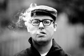
I like this image because of the fact that the smoke adds a fluid element to the image as well as going against stereotypes regarding the types of people who smoke.  This image's shallow depth of field allows the viewers eye to focus solely on the subject who's deadpan expression gives no clues towards their emotional state.  The fact that the smoke would be different in any other time and is impossible to identically replicate means that this image conforms to Bresson's "decisive moment".


I like this image because it is a full body shot which looks extremely natural due to the positioning of the subject in the foetal position in the images centre.   I also like the way that the green outfit of the subject blends into the background of green.


I like this image because of the way that the lighting comes from under the umbrella and highlights both the subject and the pages of the book and the rain drops.  I particularly find the tonal range and contrast between the bright white of the book and the deep black of the background.  The surrealism of this image also appeals to me.

Thursday, 19 November 2015

Joiners- Image bank

Portrait Joiners


I like this image because of the way that the subjects face is pieced together using images taken from a variety of different angles.  This effect gives the image a somewhat warped effect or the appearance that the subject may have been moving her head as the image was taken.


I like the way that this image is pieced together using separate photos to create a scattered effect.  This is intriguing to me as it provides the image with a detached appearance whilst the entirety of the image can still be seen.


I like this image because of the way that the face appears to be blurred due to the way that the image has been moved and joined in the editing process.  The clean lines of this image are aesthetically pleasing and create a smooth effect.

Landscape Joiners


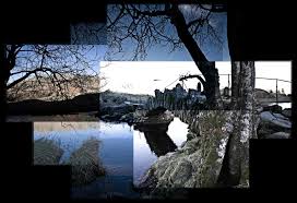
This image appeals to me because of the way in which the images are pieced together in a way that makes the image appear to be disjointed and unnatural despite the nature calmness of the image.


I like the way that the stacked photographs create an effect similar to that of a scattered pile of photographs.  This gives the photo joiner an imprecise and casual appearance.  


I like the way that the image is pieced together very accurately to create an accurate recreation of the image with a varied aspect of tone.  This tonal range is particularly intriguing due to the fact that despite the image not being in black and white or greyscale the cold blue tones create a similar effect.


Tuesday, 10 November 2015

Depth- Image bank

Estimated F-stop F/16.


I like the way that the shallow depth of field is combined with the contrast between the red and the white of the background  in order to draw the viewers the eye to the coke can.  

Estimated F-stop F/13


I like this image because of the way that the sharp lines created by the pencil in the foreground contrast drastically with the more blurred lines of the pencils in the background of the image.  I also like the way that the bright colours in the image contrast with the white background to draw the viewers eye to the pencils.

Estimated F-stop F/11


I like this image because of the way that the planks of wood the make up the bench create a slight converging line which draws the eye towards the red light at the end of the bench and creates a focal point.  The light reflecting off of the bench also draws the eye into the image.    I think that the use of a high F-stop and shallow depth of field gives the image a sense of mystery as the viewer is unaware of what exists outside of the focused area.

Estimated F-stop F/2


I like the way that the low shot of the building with it's wide depth of field creates a crisp image.  The images also appears to be a wide angle shot which helps to immerse the viewer in the image.  The converging lines of the buildings also appeal to me as they also contribute as am method of drawing the viewer into the image.  

Estimate F-stop F/12


This image appeals to me as I like the way in which the bowling balls draw the viewers eye to centre of the image as a result of the low depth of field in the image.  I also feel that the bold colouration of the bowling balls creates an aesthetically pleasing contrast between the more neutral tones on the setting. 

Estimate F-stop F/12


I like the way that the shallow depth of field in the image leads the viewer to focus on the beetle which has been positioned in the centre left third of the image.  The contrast between the yellow and purple of the beetle is also essential in drawing the viewers eye to the beetle as purple (the beetle) and yellow (the flower) as well as blue (the beetle) and orange (the background are complimentary colours.


Thursday, 5 November 2015

Movement- Image bank


This photo appeals to me because of the way in which the image captures the matches as they are falling, this creates an interesting and impermanent shape that would be almost impossible to recreate.  This element of impermanent shape that makes the image com from to Bresson's definitive moment.


 This photo appeals to me because of the way in which the long exposure photo captures the way that overtime the movement of the light creates a pattern.  I also like the way that the varied saturated and bright colour scheme of the lights gives the image a wild, psychedelic appearance.


I like the way which the long exposure photo creates lines where the lighting is not coming from a fixed point but the lights which are in a fixed position retain there original shape and form.  I also like the way that the red and the blue lights create a high contrast in colour.


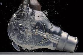
I like this image because of the way that the photo captures the moment that the bulb breaks in detail.  This is particularly interesting as this would be impossible to see in real life.  I also like the stark contrast between the black of the background and light tones of the bulb.


This image appeals to me because it uses long exposure setting used allows light trails to be formed by the stars due to the way that the earth orbits whilst the image is being taken.


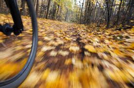
I like this picture because of the way that the shallow depth of field and focus allows for movement to be clearly shown by the bikes surroundings.  The positioning of the bikes wheel in the left third of the image helps to draw the viewers eye to the bikes wheel making it the focal point of the image.

Tuesday, 20 October 2015

Reflection- Image bank


I like this image because of the way that the artist has created the image of the girl in the mirror without having the camera appear in the picture although the camera could have been removed in photoshop.  The image was either achieved by having a double model wearing the same dress stand in front of the mirror whilst another held it or by talking to separate images of the same girl and inserting the image whilst editing.  I feel that the surreal feel of this image is added to through the tonal contrast of range of the black and white.


I like this image because of the way that the artist has manipulated the image to create the illusion of reflection. This has been done in photoshop by inserting a cropped version of the original image into each image.  There a sense of ambiguity as the subjects face is removed from the image.


I like the way that the artist has captured themselves in this image using the element of  reflection in their photography.  I am also intrigued however as the photographer has implemented lighting to make their face a silhouette as well using the converging lines of the sky scrapers to give the image depth.


 I like the way that artist has manipulated the artist by editing to image together to create the illusion of a reflection.  This image is also interesting as colour selection has been employed in order to leave the shoes in colour whilst the rest of the image is in black and white.


This image appeals to me as I like the way that the artist has used camera angles as well as lighting in order to create a reflected image.  I also like the way whilst the image is not in black and white it has a strong tonal range amongst it's dull tones which provides depth to the image.


I like the way that the artist has used focus to draw your eye to the centre of the image and the frog by using a shallow depth of field to prevent the viewer from focusing on the objects on the surface of the lake surrounding the frogs reflection.  I also like the pink in the reflection as I feel that this provides the image with an interesting element of contrast.