Thursday 22 October 2015

Reflection of light- Work diary

Evaluation
The objective of the assignment was to capture the element of reflection of light around the college campus and in the studio. This was a harder element to capture as there have to be specific conditions for reflection to be successfully captured.

Favourite image

1/180, f/3.5, ISO 80


This is my favourite image due to the way that the bright colouration of the monkey pin badge contrasts distinctly with the dark black and white tones of the rest of the image.

Least favourite image

1/6, f/3.7, ISO 80


I do not  like this image due to the fact that as I did not use a tri-pod which meant that my image was blurry.  I am also unhappy with the colouration of the image as I feel that the blue and gold tones are not aseptically pleasing when combined.

Progression
When carrying out this shoot the weather was not desirable this meant that lighting for my reflected images were not always reflective.  I did not have to use very much zoom in this shoot either which means that all of my images are clear with no blurred edges.  There is nothing I would change about this shoot other than the location.


Reflection of light- Straight images

I like this image because of the way that the light reflects from the badges and the way that the yellow badge pops.


I like the way that the black and white colour manipulation makes the yellow badge stand out even more and emphasises the reflection of light from the badge.


I like this image because of the way that the light shines off of the glass and the way that the light adds an interesting coloured affect to the artists arm.


I have manipulated this image by increasing the contrast and decreasing the brightness around the glass and the object this helps to make the colours on the subjects arm to appear more bold and striking.


Reflection of light- Contact sheet


Wednesday 21 October 2015

Form- Work diary

Evaluation
The objective of the assignment was to capture the element of form using photography in Harlow Town center and on the college campus. This was a relatively easy element to capture due to the fact that form can be represented in a variety of different formats. There was also an overlap between the formal element form and the formal element shape.

Favourite images

1/320, f/3.4, ISO 100


This is my favourite image because of the way that contorted around the gate.  I think that this showcases the human form well.  I have manipulated the image by decreasing the saturation of the image and increasing the brightness and contrast of the image.

Least favourite image

                                                          1/150, f/3.1, ISO 200


This is my least favourite image because I don't believe that it shows form successfully. 

Progression
When carrying out this shoot there was good lighting so the shoot was successful.  I did not have to use very much zoom in this shoot either which means that all of my images are clear with no blurred edges.  There is nothing I would change about this shoot other than the location.

Aspirations
Tim Booth's use of form to demonstrate personal characteristics interests me as his use of the form of a hand and minimal props allows for the subject to be known without their face being seen.


Tuesday 20 October 2015

Reflection- Work diary

Evaluation
The objective of the assignment was to capture the elemement of reflection using photography in Harlow town centre and the college campus. This was a more difficult element to capture as reflection requires specific setting to be successfully captured.  Many of my reflection images contain the other formal elements.

Favourite image

1/430, f3.9, ISO 80


This was my favourite image because of how the reflection of the building can be seen in the hand mirror.  I manipulated the image by increasing the contrast and brightness of the image.

Least favourite image

1/90, f3.1, ISO 200


This is my least favourite image for this formal element as it does not display reflection well at this stage.  The image was inspired by Francesca Woodman but under the conditions provided I could no successfully achieve the desired effect.

Progression
The weather on the day of the soot was not desirable as it was not sunny meaning it was not bright enough for successful reflection from windows and it was not raining meaning there were no puddles to photograph.  In the feature I would plan my shoot to take place on a more appropriate day.

Aspiration
I am intrigued by the surreal effect which is created through the use of reflection in bubbles by Richard Heeks.


Reflection- Straight image

This image appeals to me because of the way that the reflection allows the viewer to see an element of the image which would not normally be visible.


I have manipulated this image by decreasing the saturation of the image and increasing the contrast to add definition to the subject of the image.


I like this image because of the way that the reflection allows the viewer to see the photographer and the fact that there are three photographers present in the image adds an element of mystery as to which photographer took the image.

I have manipulated this image with a black and white filter to help increase the likeness of the subjects of the image.


I like this image because of the way that it shows what is taking place behind the subject of the photo and helps to give the viewer a better understanding of the location of the shoot and more context for the shot.


I have increased the contrast and the brightness of the image which adds clarity and definition to the reflected image.


I like this image because of the way the different types of metal reflect light in different ways and create a variety of different shades and hues of light.


I have increased the brightness and the contrast of this image to give more emphasis to the reflection of light from the sculpture.


I like this image because of the way that the duck is reflected by the water and the way that earthy tonal colours such as green and brown makeup the majority of the colouration in the image.


I have manipulated this image by increasing the contrast and reducing the brightness to give the image a more vibrant quality.


Reflection- Contact sheet


Vivian Maier

Information
D.O.B- 01/02/1926
Place of birth- New York, America
D.O.D- 21/04/2009 (83)
Place of death- Chicago, Illinois, America
Occupation- Nanny
  • Maier's work was unknown in her lifetime as she never published it, a number of Chicago based collectors discovered her work in 2007.
  • Her mother was French and moved to New York where she worked in a sweat shop.
  • She worked for two families as a nanny and is reported as "being a real life Mary Poppins".
  • After failing to keep up payments on a storage unit after her death Maier's photos and audio recordings were seized and auctioned.


Was Maiers work art?
Here is the definition of art:

It is stated above that art is the expression of a humans creative skill which can be appreciated for its beauty to emotional power so in a literal sense there can be no doubt that what Maier was producing at this time should be classed as art.
In my opinion I agree with the above statement as I find Maiers work both beautiful and intriguing and whilst others may not share my opinion it is not possible that this piece of imagery will not elicit some sort of response from the viewer whether that be dislike or fascination.  Furthermore you do not have to like something for it to be considered art.
Examples of Work


This image is intriguing due to the use of multiple mirror postponed at a variety of angles which reflect Meyer's form in different ways.  This image has a somewhat eccentric air which fits into Meyer's personality.


This image is interesting as the Volkswagen logo links this image to the time in which it was shot as in the time of Meyer's photography career Volkswagens were a popular car.  Meyer's self portraiture here is intriguing as she has positioned herself in a way which makes her smaller than the logo and possibly carries the connotations of the power of the capitalist society.


This image interests me as it is an example of Meyer's candid photography work in which she rarely asked the subjects permission before or after taking her photos.  The reflection in the water is interesting as it makes the subjects appear darker than they are when contrasted with the bright sun behind them.

Influence on my work
Meyer's work has inspired me to experiment with black and white imagery in relation to reflection and self portraiture.


Reflection- Image bank


I like this image because of the way that the artist has created the image of the girl in the mirror without having the camera appear in the picture although the camera could have been removed in photoshop.  The image was either achieved by having a double model wearing the same dress stand in front of the mirror whilst another held it or by talking to separate images of the same girl and inserting the image whilst editing.  I feel that the surreal feel of this image is added to through the tonal contrast of range of the black and white.


I like this image because of the way that the artist has manipulated the image to create the illusion of reflection. This has been done in photoshop by inserting a cropped version of the original image into each image.  There a sense of ambiguity as the subjects face is removed from the image.


I like the way that the artist has captured themselves in this image using the element of  reflection in their photography.  I am also intrigued however as the photographer has implemented lighting to make their face a silhouette as well using the converging lines of the sky scrapers to give the image depth.


 I like the way that artist has manipulated the artist by editing to image together to create the illusion of a reflection.  This image is also interesting as colour selection has been employed in order to leave the shoes in colour whilst the rest of the image is in black and white.


This image appeals to me as I like the way that the artist has used camera angles as well as lighting in order to create a reflected image.  I also like the way whilst the image is not in black and white it has a strong tonal range amongst it's dull tones which provides depth to the image.


I like the way that the artist has used focus to draw your eye to the centre of the image and the frog by using a shallow depth of field to prevent the viewer from focusing on the objects on the surface of the lake surrounding the frogs reflection.  I also like the pink in the reflection as I feel that this provides the image with an interesting element of contrast.


Reflection- Definition post

Dictionary definition- The throwing back by a body or surface of light heat or sound without absorbing it.
Personal definition- The repetition of heat, sound or light as a result of not being absorbed.


Surrealism- a cultural movement that began in the early 1920s, and is best known for its visual artworks and writings. The aim was to "resolve the previously contradictory conditions of dream and reality".

Shape studio- Work diary

Evaluation
The objective of the assignment was to capture the elemement of shape using photography in the studio. This was a relatively easy element to capture due to the fact that shape can be represented in a variety of different formats.  There was also an overlap between the formal element shape and the formal element form as form is a 3D shape.

Favourite image

1/45, f/3.6, ISO 400


This was my favourite image for shape because of the lighting used to create the shape of the cameras shadow.  I have manipulated the image by adding a black white filter and increasing the images contrast to create a more defined shape of the cameras shadow.

Least favourite image

1/20, f/5.6, ISO 200


This is my least favourite image because the camera was not in focus when the shot was taken and it was poorly lit and it was also shot at the wrong camera angle.

Progression
The lighting for this shoot was successful however unfortunately the camera was out of focus in many of the shots as I attempted to use manual focus.  If I were to refer the shoot I would bring a tri-pod and use auto focus on the camera.


Shape- Work diary

Evaluation
The objective of the assignment was to capture the formal element of shape through photography.  This was an easy element to capture due to the fact that all objects are made of shapes.  There was also an overlap between the formal element shape and the formal element form due to the fact that form can be classed as 3D shape.

Progression
I think that this shoot went well as the weather was suitable for the shoot.  If I were to do the shoot again I may bring a tri-pod to keep the shot more steady.

Favourite image


1/390, F5, ISO 80


I like this image because of the way that the human form represents shape.  It also appeals to me because of the way which the image has been edited with colour select to centre the eye on the subject.

Least favourite image


1/450, f3.6, ISO 200


This is my least favourite image in the formal element of shape as I don't believe that it represents shape effectively. It is an image that would have been more suited to the formal element of line.

Aspirations
I find the below images taken by Phillip Klinger to be intriguing and would like to produce work in a similar style to his in the future.


Thursday 15 October 2015

Shape studio- Straight images


I like this image because of the way that the light reflects from the gold chain and the way that the shadows are created through the watch cover.


I have edited this image by reducing the brightness and saturation as well as adding contrast to the image.


I like this image because of the way that the pages of the book form the shape of the heart.


I have edited this image by colour selecting the book and turning the rest of the image black and white. I have also reduced the images saturation and increased the contrast.


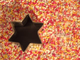
I like the way that the small shapes of the smarties combine to make an interesting pattern of shapes.


I have turned this image black and white to give more dimension to the shapes.


I like this image because of the shape of the watch and the way that the light reflects from the chain.


I have edited this image by increasing the images saturation and contrast to make the gold on the chain more pronounced.


  I like this image because of the way that the cameras shadow creates an interesting shape.


I have turned the image black and white to emphasise the shadow created by the camera.  I have also increased the images contrast to make the camera itself stand out more against the background as well as decreasing the brightness of the image.