
I like this image because of the way that the complimentary colours of red and green make the red flowers stand out dramatically against the green background. The fact that the background of the image is blurred and so the image has an increased depth of field helps to make the red flowers stand out.

I like this is image due to the fact that the shallow depth of field used has created a blurred background which makes the bright pinky purple flowers in the images foreground stand out against the dull yellow of the background. This is also a pleasing image due to the fact that the pinky purple and muted yellow used are complimentary colours.

I like this piece because of the placement of the bike in one of the thirds of the image this draws the eye in to the picture the woman is also in a third of the image but the depth of field allows the eye to focus on the bike first and then focus on the more blurred woman afterwards. I also like the fact that both the bike and the woman have splashes of red on them, this helps to pull the image together as well as to draw the eye in.


I like these images due to the way that the bright multicoloured lights of both the candles flames and the lanterns bulbs create a strong sense of contrast between the images subject and the it's black background. These images are particularly interesting due to the way in which each image creates a strong sense of contrast and guides the viewers eye through the use of colour without having to employ a shallow depth of field.
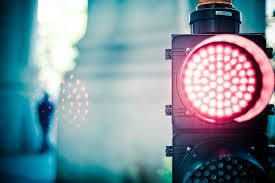
I like this picture because of the way that the colours are muted and dull it makes the muted red stop light stand out against the rest of the dull image. The stop light also stands out due to its placement in the third of the image so that the viewers eye is drawn to it.
No comments:
Post a Comment