Tuesday 29 September 2015

Form- Straight images

Straight images


I like this image because of the way that the shadows which have been created by the angle of sunlight as it helps to highlight the form of the hand in the image.


I like this image because of the way that the contortion of the hand in the image combined with the shadows of the bars on the hand highlight the form of the human hand.


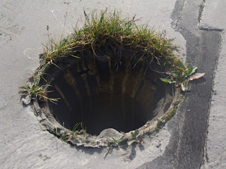
I like the way that the absence of light in the hole creates an element of depth to the image which shows the form of the whole.  The depth is also shown by the converging lines which draw the eye into the center of the image and the hole.


I like this image because of the way that the light hitting the bottles highlights the top of the bottle and the shadows around the base of the bottle add an element of depth.


I like the way which the smashed bottle shows the destruction of form and the way that the shards maintain elements of form with the highlights created by lighting and the way that the edges of shards helps to give the image depth and as a result demonstrates form.

Form- Image bank


I like this image because of the way that the form of the spiral staircase which is a man made object replicates the form of a natural shell.  I also find the way in which shadows and lighting have been implemented in order to give the image more depth.


I like this image because of the way that the light reflecting off of the metal part of the pen reflects the light and creates and interesting tonal contrast as well as the way that images shallow depth of field makes the viewer focus on the pen nib and it's engraving.


This image appeals to me because I like the way that the vibrant green of the plant contrasts with the solid dense colouration of the black background.  I also like the way that the images shallow depth of field draws focus to the images foreground.


I like the way that the picture shows the form of the pencil in two different ways.  I also like the way that this image uses reflection to mirror the shape of the objects form; the colour pattern is also mirror as the pencils are ordered red, yellow, blue but the shavings are ordered blue, yellow, red.  The use of primary colours (red, yellow and blue) also intrigues me and I like the way that the bold colouration stands out from the black background.


I like the way that the shadows help to create the tone and 3D form of the pine cone.  The shallow depth of field in this image also interests me because of the way that it draws the viewers eye to the images foreground where the pinecone is positioned.


I like the way that the lighting creates shadowing which helps to fully show the form of the keyboard.  The black and white tones as well as the depth of field and close up shot also helps to demonstrate form.  Interestingly the image displays a shallow depth of field which makes the viewer's eye focus on the images centre opposed to background or foreground.


Form- Contact sheet


Pattern- Straight images

Straight images


I like this image because of the way that the different shades of grey that make up the metal of the street lamp create an interesting pattern.


I like this image because I like the way that the pattern of stripes created by the steps consists of the bold shade of yellow and the more dull grey tone.


This image appeals to be because I like the way that the sharp lines of the metal create a combination of cross patterns.  I also like the way in which the dark grey and light grey coloration creates a stark contrast.


I like this image because I like the way in which the close up shot of the tiles creates an interesting pattern.


I like the pattern created by the feathers on the pigeons wings as well as the stone tiles on the floor.


I have cropped the above image and increased the saturation and decreased the brightness of the image in an attempt to make the pattern of the feathers more visible.

Form- Definition post

Dictionary definition- The visible configuration or shape of something.
Personal definition- The composition of a 3D object.

Pattern- Contact sheet


Monday 28 September 2015

Pattern- Work diary

Evaluation
The objective of this assignment was to capture the formal element of pattern through photography.  This was a more difficult element to capture due to the fact that pattern has a lot of crossover between line and texture and the location that I was shooting at did not have a great deal of patterns present and those that it did were largely comprised of lines for example zebra crossings.

Favourite image


1/480, F5.6, ISO 80


This is my favourite image because of the way in which the buildings structure creates a number of different shapes depending on how you look at the image.  I am also drawn to this image because of the contrast between the light and dark elements of the structure.

Least favourite image


1/60, F5.6, ISO 200


I dislike this image because of the way in which the pattern in the images leaves are not the focus of the image a way to achieve this appearance would be to shoot closer to the leaf, use a shallow depth of field or a macro lens.

Progression
For this formal element I encountered many of the same issues that I had with texture such as struggling to keep the camera still and in focus when zooming in.  If I were to repeat this shoot I would consider the use of a tripod and looking macro photography.  I would also plan to take the photos on a brighter day as it was extremely overcast when I took the images meaning that I had to regular use the flash setting on the camera to capture the vibrant colours of the image unfortunately this sometimes created an overly saturated and poorly lit image.

Aspiration

I would like to be able to produce images of the high quality and variety displayed in Anne Belmont's work.


Texture- Work diary

Evaluation
The aim of this assignment was to capture the formal element of line through photography.  This was a slightly harder element to capture due to the fact texture photography works best with shadows but it was a relatively dark day when the photos were taken which slightly dims the effect of the texture contrast.   There was a large overlap between texture and pattern as many patterns are made up of textured materials. 

Favourite image
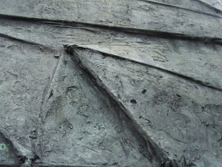
This is my least favourite image because of the fact that the sculpting of the stone creates a variety of visible textures.  I feel that the texture in this image is amplified by the fact that the image is all one colour, this singular colour creates a larger sense of contrast between the shadows of the image and it's surface therefore creating a greater sense of depth in the image.

1/320, F3.6, IS0 100


Least favourite image 
This is my least favourite image because of the way that the image crosses over with the element of line. I feel that if I had shot using a deep depth of field on the bikes tyre opposed to a shallow depth of field over the portion of the wheel that I would have created an image more representative of texture.

1/150, F4.3, ISO 200


Progression

For this formal element I had to zoom in frequently and it was sometimes a struggle to keep the camera still and in focus.  If I were to do this shoot again I would consider using a tripod and exploring macro photography to create more steady and detailed images.

Aspiration
I would aspire to create images in a similar style to Lucy Shires.


Colour- Work diary

Evaluation
The objective of the assignment was to capture the formal element of colour through photography.  This element was particularly enjoyable to capture for me due to the fact that colour is present in all things in various different forms such as muted and saturated.  This formal element overlaps with other elements due to the fact that everything has colours in it.

Favourite image

1/500, f/5.3, ISO 1600


This is my favourite image for colour due to the way that the bold yellow stands out against the dull grey background.  I find this image especially appealing due to the fact that I did not edit this image in photo shop.


Least favourite image

1/800, f/14, ISO 1600


This is my lest favourite image due to the fact that I don't believe that colour is well represented in this image.

Progression
I think this shoot went very well due to the fact that it was a very bright sunny day meaning that the colours present were particularly vibrant which helped to make the complimentary colours stand out against each other.

Aspirations
I like the appearance of Vivian Meyer's work as it displays colour in a simplistic and understated way.


Line- Work diary

Evaluation
The objective of the assignment was to capture the formal element of line through photography.  This was a relatively easy element to capture due to the fact that everything is composed of lines from buildings to people.  There was also an overlap between the formal element line and the formal element pattern due to the fact that many patterns and markings are also comprised of lines such as zebra crossings.  


Favourite image


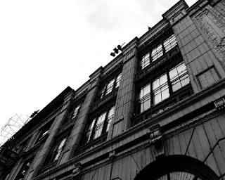
This is my favourite image because of the way that the lines of the lights on the building draw the viewers eye up to the roof top which is in itself a slanted line.  I find this combination of varied lines interesting and I have attempted to add contrast to this image by making it black and white to draw focus to the lines.

Least favourite image


This is my least favourite image because of the limited way that line is featured in the image.  I also feel that the colouration in this image is dull and not very striking or bold.


Progression
This was the first time I had used the equipment so there were a few errors in the focus of some of the images but overall I think the shoot went well. It was a sunny day with few clouds so there was very good lighting on the shoot.  I had a second shoot in Florida which is where I was able to photograph my favourite image, this has shown me the value of a varied location as I was able to take an interesting image.

Thursday 24 September 2015

Pattern- Define

Dictionary definition- a repeated decorative design.
Personal definition- a series of dots or lines which covers an object in either a regular or random formation.  Patterns can be both natural and man-made.

Manmade- Tile


Nature- Scales


Texture- Straight images

Texture- Straight images

I like this image because of the appearance of the water droplets and the way that the red stems of the leaves contrasts with the green of the leaves.


I like this photo because of the way that the lighting casts shadows and gives a good appearance of texture.  I like the way which the coin is positioned in the left bottom third of the image so draws your eye into the image.

I like this image because I like the way that the shadows cast by the various layers of stone create an interesting textured appearance on the stone.


I like this picture because I like the way that the different tones of the brick combined with the shadows create a crumbly appearance and texture.


I like because the close up shot and depth of field give it a flaky textured appearance and the red compliments the green of the moulded surface and makes it stand out.


Texture- Contact sheet


Tuesday 22 September 2015

Colour- Definition post

Colour definitions
Dictionary definition- The property possessed by objects which produces sensations on the eye depending on the way which the object emits or reflects rays of light.  
Personal definition- The hue or tone of an object.

Saturation- The intensity of a colour the more saturated the image the brighter the colours.

Huea colour or shade.

Valuethe relative lightness or darkness of a colour.


Saturated colour- Colours which have an increased intensity.

Muted colour- Colours which have a reduced intensity.


Analogous colours- Groups of three colours which are side by side on the colour wheel.  Comprised of one primary colours, one secondary colour and one tertiary colour.


Complimentary colours- Colours which are on opposite sides of the colour wheel so make each other stand out.  When combined they can also make black or white.