Thursday, 26 November 2015

Portraiture- Straight images


These images have both been edited to reduce their saturation whilst the top images has also been edited to add sharpness to the image in order to enhance the detail around the subjects eye.  I have also darkened the bottom image.  I feel that these changes have helped to make the image seem more interesting the viewer by creating a larger tonal range in the images.


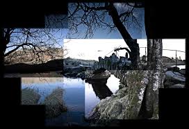
The top image has not been edited however the bottom image is a collection of Thomas Ruff inspired portraits I chose to do this as I felt that the original image was somewhat boring and felt that adding more elements to the image through multiple imagery would make the image more eye-catching and engaging to the viewer.


Portraiture- Contact sheet

Shoot 1- Outside


Shoot 2- Studio


Tuesday, 24 November 2015

Portraiture- Selected artists

Richard Averdon


Thomas Ruff


Alec Soth


Portraiture- Image bank


This image appeals to me because of the contrasting coloration of the models red hair and the blue background and body paint, this colour difference is particularly interesting due to the fact that blue and orange are both complimentary colour.


I like this image because of the way that the polaroid is placed over the subjects face to create a mask this could also represent someones internal pain and the way that society prevents them from speaking about their pain instead having them internalise it.  This is an intriguing piece of perspective photography.


I like the way that this image has been altered in editing to add a streak of colour over the image.  This effect would have been achieved through selective colouration in photoshop.


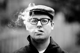
I like this image because of the fact that the smoke adds a fluid element to the image as well as going against stereotypes regarding the types of people who smoke.  This image's shallow depth of field allows the viewers eye to focus solely on the subject who's deadpan expression gives no clues towards their emotional state.  The fact that the smoke would be different in any other time and is impossible to identically replicate means that this image conforms to Bresson's "decisive moment".


I like this image because it is a full body shot which looks extremely natural due to the positioning of the subject in the foetal position in the images centre.   I also like the way that the green outfit of the subject blends into the background of green.


I like this image because of the way that the lighting comes from under the umbrella and highlights both the subject and the pages of the book and the rain drops.  I particularly find the tonal range and contrast between the bright white of the book and the deep black of the background.  The surrealism of this image also appeals to me.

Portraiture- Definition post

Dictionary definition- a painting, drawing, photograph, or engraving of a person, especially one depicting only the face or head and shoulders.
Personal definition- an image which depicts a subjects face or head.

Candid- a photograph of a person taken informally, especially without the subject's knowledge.


Posed- to assume a particular position in order to be photographed, painted, or drawn.


Portraits can conform to old fashioned portrait formats such as being face on.


Or they can break away from traditional practices to create far more interesting but less standardised images which can form a more emotional connection with the viewer.


The second image has an element of mystery due to the fact that the subject is not looking directly at the camera like the subject in the first image is.


Thursday, 19 November 2015

Joiners- Image bank

Portrait Joiners


I like this image because of the way that the subjects face is pieced together using images taken from a variety of different angles.  This effect gives the image a somewhat warped effect or the appearance that the subject may have been moving her head as the image was taken.


I like the way that this image is pieced together using separate photos to create a scattered effect.  This is intriguing to me as it provides the image with a detached appearance whilst the entirety of the image can still be seen.


I like this image because of the way that the face appears to be blurred due to the way that the image has been moved and joined in the editing process.  The clean lines of this image are aesthetically pleasing and create a smooth effect.

Landscape Joiners


This image appeals to me because of the way in which the images are pieced together in a way that makes the image appear to be disjointed and unnatural despite the nature calmness of the image.


I like the way that the stacked photographs create an effect similar to that of a scattered pile of photographs.  This gives the photo joiner an imprecise and casual appearance.  


I like the way that the image is pieced together very accurately to create an accurate recreation of the image with a varied aspect of tone.  This tonal range is particularly intriguing due to the fact that despite the image not being in black and white or greyscale the cold blue tones create a similar effect.


Wednesday, 18 November 2015

Joiners- straight images

Portrait
Image 1

I like the way that this image appears to disjointed due to the way that the images have been placed.  I particularly like the ear due to the way that it is a seperate image layered over the rest of the head.

Image 2


I like this image because of the way that the images are layered over the base image to create a transition effect between gas mask and human face.  I also like the way that the hand is visibly larger than the other due to both the placement of the limb in the original image as well as the image placement in the editing process.

Landscape
Image 1

I like the way that the building is built up in a way similar to that of a tiered cake.  This gives the greater empasise the leading and converging lines of the image.

Image 2

I like the way that the image has seperate pieces of the tree added to it using other images to create a branching off effect.

Image 3

I like the way that the lines in the image are correctly joined together along the roof of the building to give the building a warped appearance.  I also like the way that the blue sign post appears multiple times as this shows the way in which the building was manipulated as well as serving to make the picture look more disjointed.

Tuesday, 17 November 2015

Joiners- Definition post

Dictionary definition- a photographictechnique in which one picture is assembled from several overlapping photographs.
Personal definition-  An image which is assembled by creating a collage effect of several overlapping photographs.

Hockney- A photographer who was at the forefront of the joiner photographer movement.


Thursday, 12 November 2015

Depth- Straight images


This image appeals to me because of the way that the images subject is not where the eye is originally drawn to as the stickers bold colouration immediately captures the viewers attention.


I have edited this image by reducing the saturation of everything except for the sticker to direct the viewers eye there opposed to at the subject who is less focused in the background of the image.


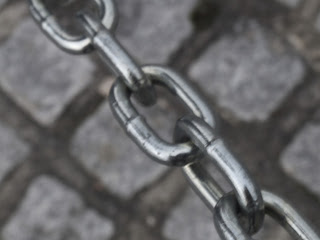
I like this image becuase of the contrast that is created between the shine of the focused chain and the grainy texture of the less focused stone floor.


I have reduced the saturation of this image to emphasise the variation if depth as well as darkening the image to bring more focus to the highlights on the chain.


I like this image because of the way that the depth of field of the image creates a blurred background, making the paper in the foreground stand out more.


I have edited this image by using the selection tool to turn the background of the image black and white as well as increasing the contrast on the rest of the image.


I like the way that the light reflecting off of the pole gives the image a sense of depth.


I have increased the contrast of the image to give it harsher appearance and bring extra attention to the pole.


I like the way that this images depth of field allows for the foreground of the image to be more focused than the background.


I have edited this image by increasing the images contrast to give the foreground a sharper appearance.


This image was shot in the studio and I like the way that the eye is drawn to the lens cap in the foreground due to the images depth of field.


I have edited this image by using the select tool to allow the lens cap to retain its deep colouration but reducing the saturation of the rest of the image to create a stark contrast.


Depth- Contact sheet


Day 1


Day 2